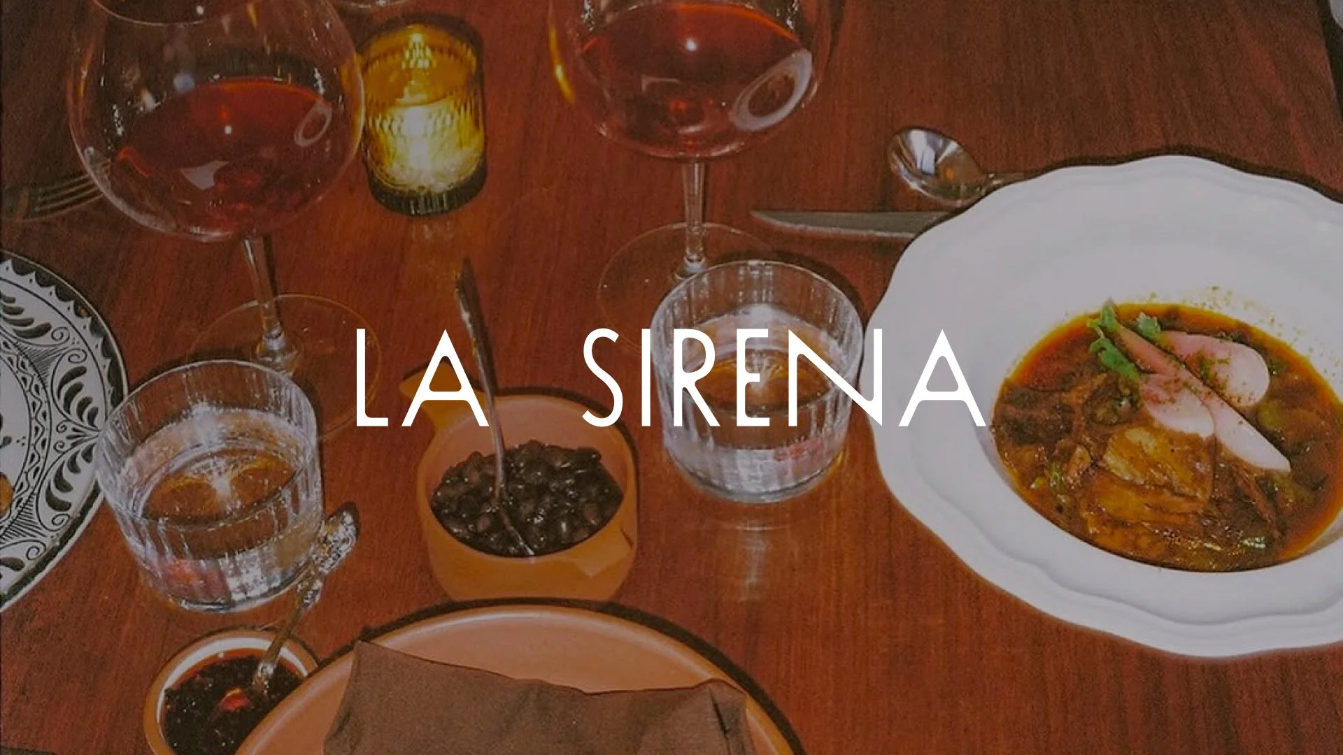
Branding Identity | Restaurant | 2025
La Sirena
Role: Creative Direction, Brand Identity
Scope: Strategy, identity, menus, environment
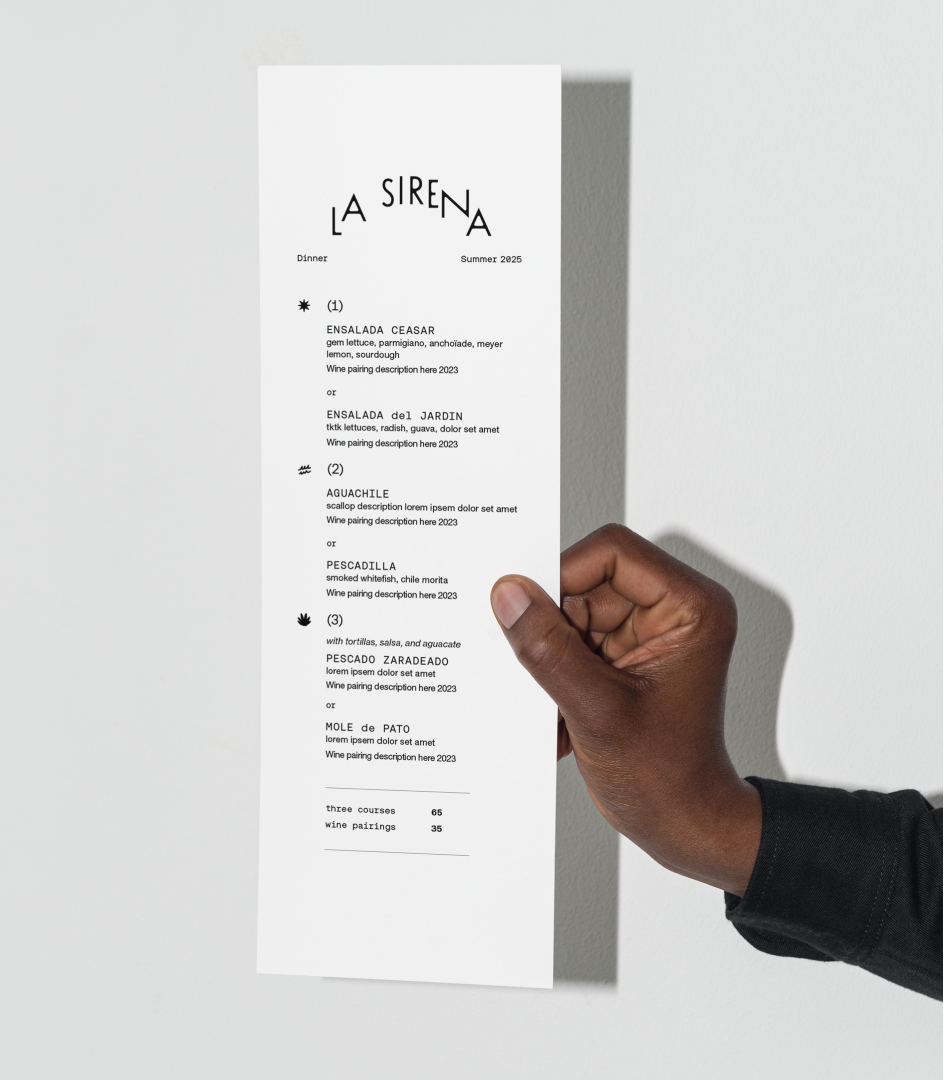
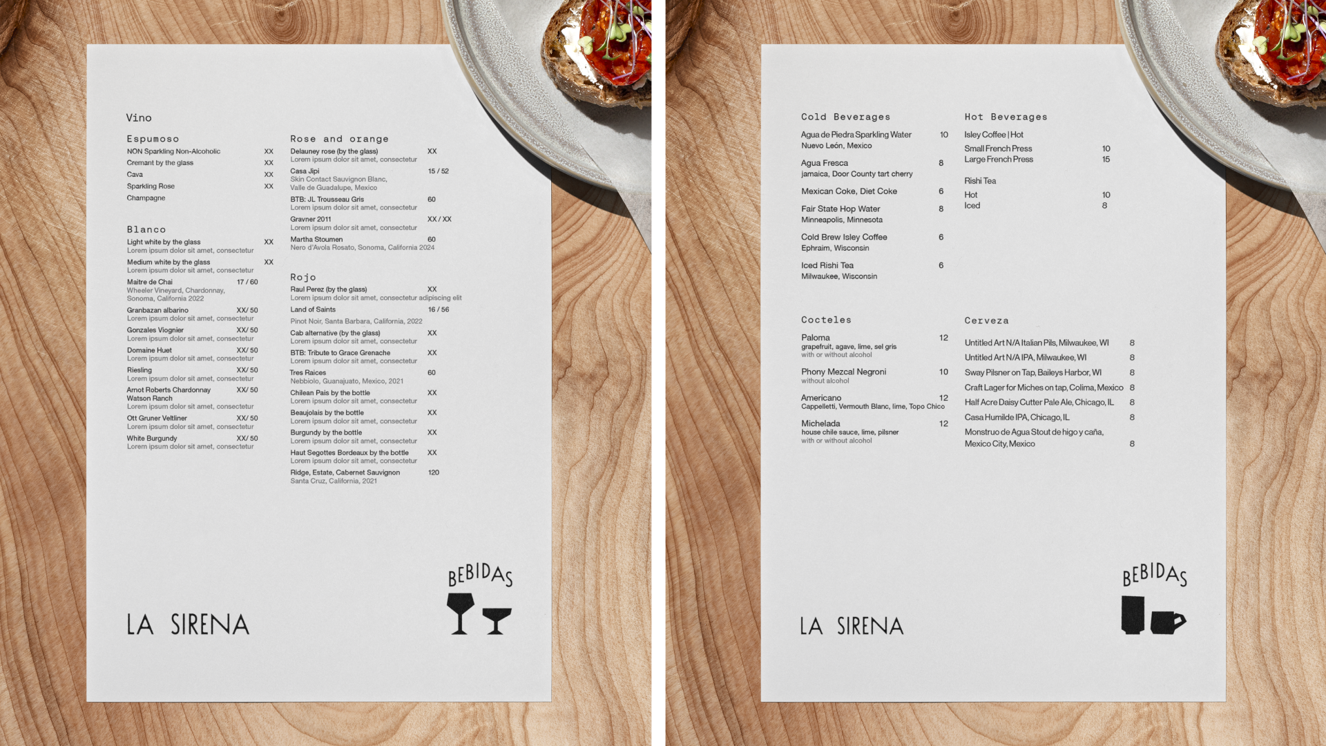
Drawing on the literary and the elemental, we built a deeply personal identity for Carlos Salgado’s most recent restaurant endeavor: La Sirena.
Photography by:
01 / CREATIVE BRIEF
The Opportunity
To create an identity that captured the restaurant’s peaceful and quiet elegance while leaving room for the mystery of its name: a siren associated with the sea, appearing somewhere unexpected.
02 / THE IDEA
A sense of place
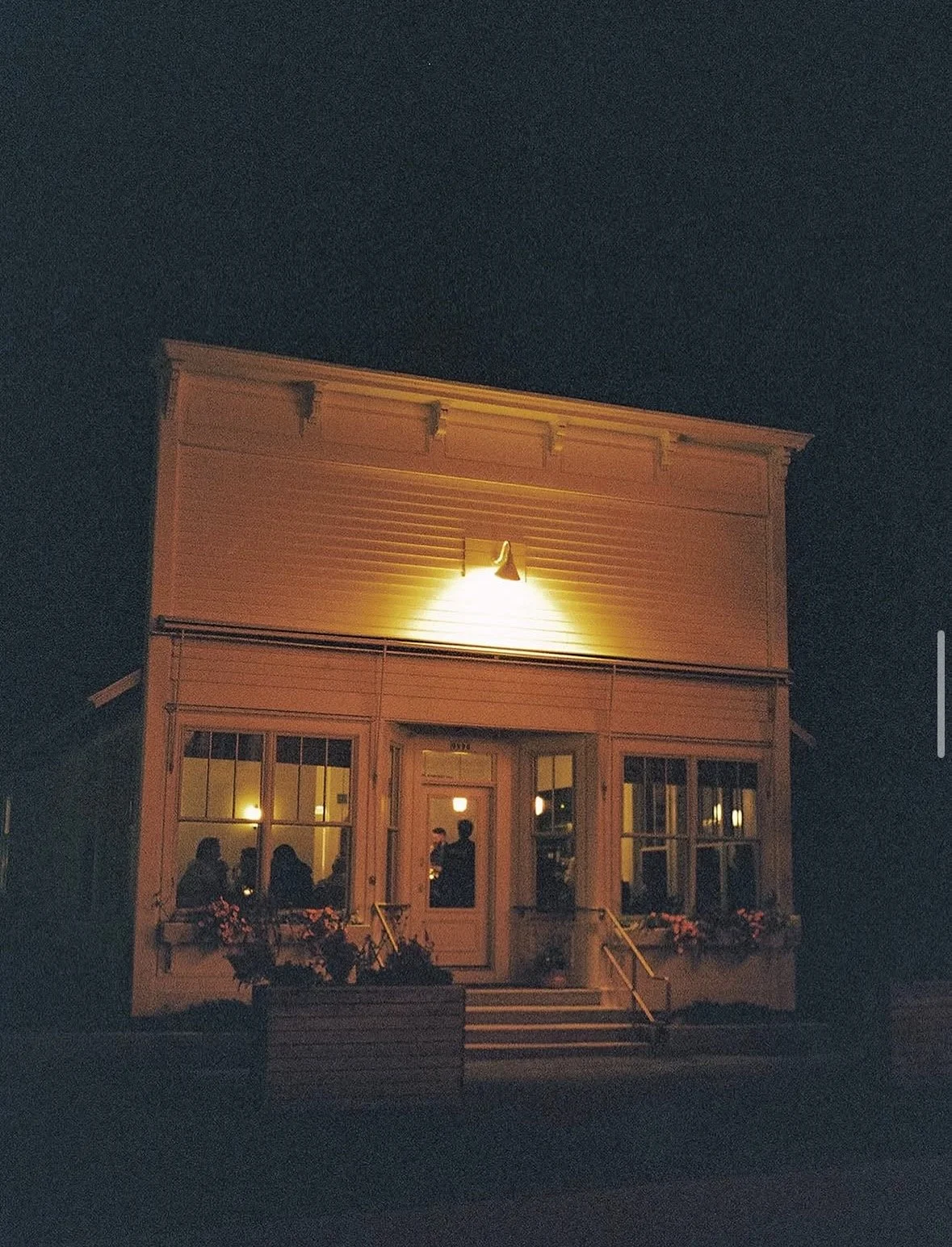
La Sirena’s identity takes its cues from the meeting point of water and shore—an intimate restaurant shaped by the landscape of Ephraim, Wisconsin.
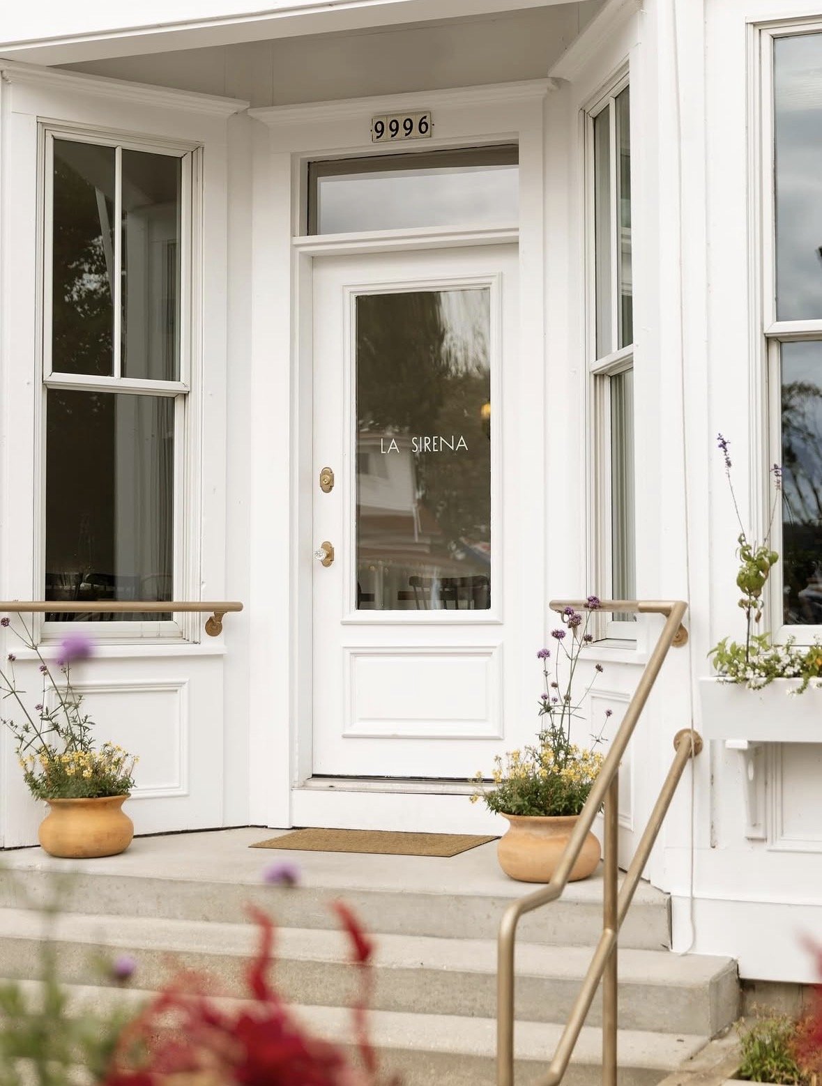

Logo
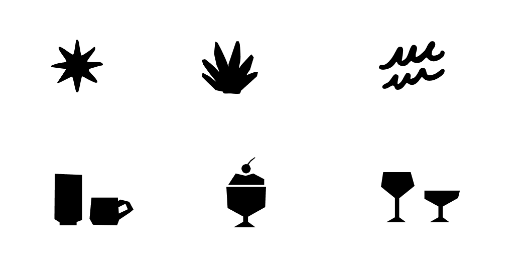
Symbol
Color Palette
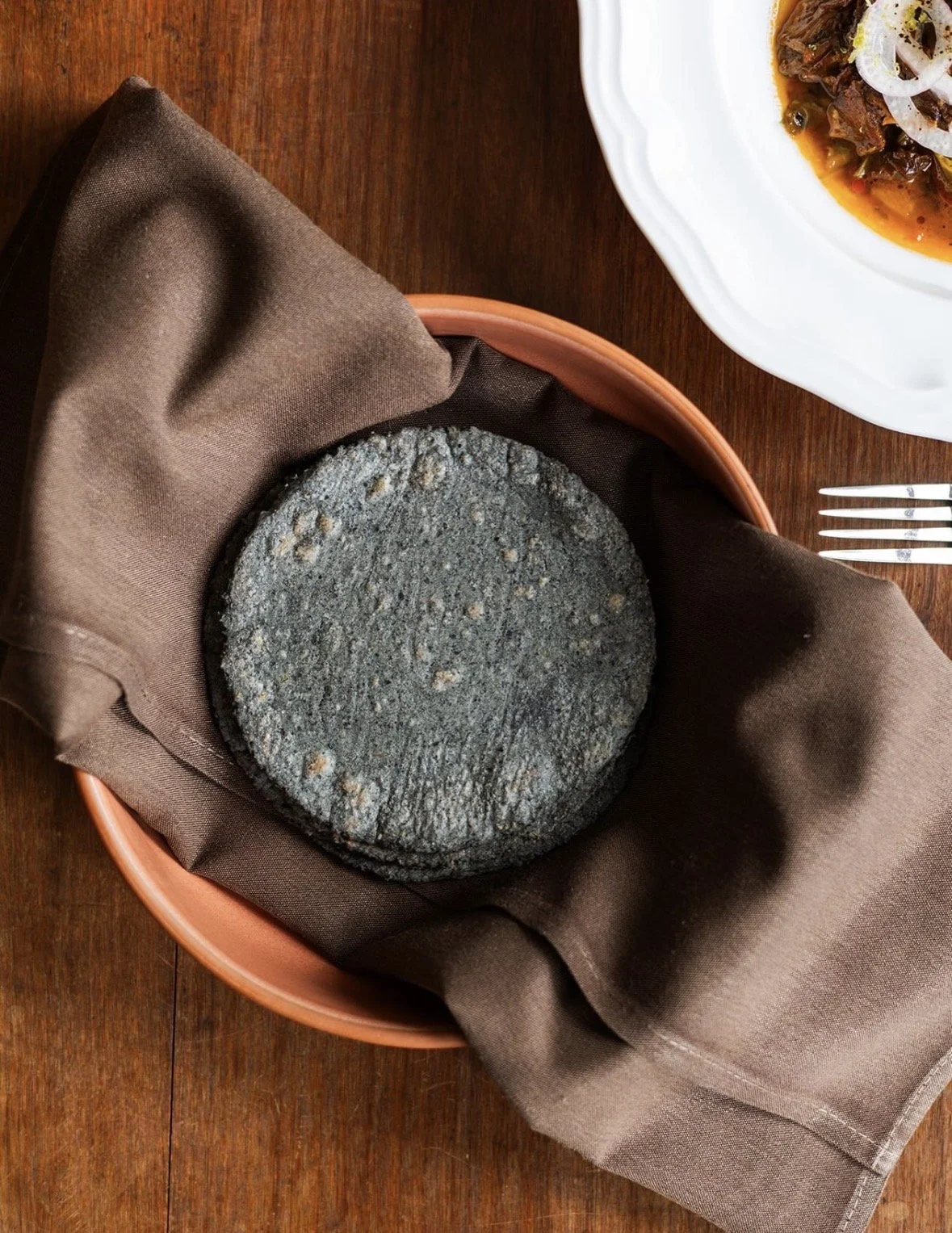
The symbol and the color palette evoke a sense of location and a connection to the geographic location. The deep corn blue is a reference to the beautiful blue tortillas on La Sirena’s menu.